Shop
Product cards for every shop layout
One FBK Product card component, many looks: pick what to show, the style, the size, the layout, the Add to cart button and the hover in its properties. Every row below is the same component.
Shop: framed photo, stars on the photo, quantity and button on one line
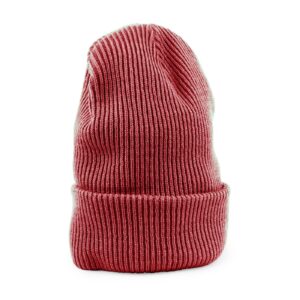 New
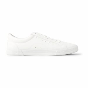 -25%New
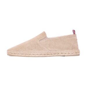
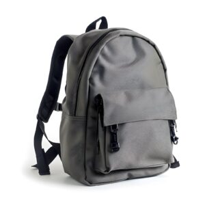
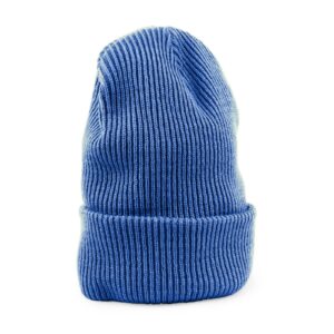
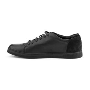
Boxed: inset photo, category and a full-width button that lifts the card
 New
Flags and pennants
Shop Pennant
 New
Eyewear
Round Sunglasses
 New
Long sleeves
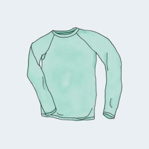
Waffle Long Sleeve
 New
Zip hoodies
Everyday Zip Hoodie, Blue
Icon button beside the price
 New
Graphic tees
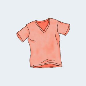
Mountain Graphic Tee
- -19%New
Hoodies
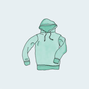
Everyday Hoodie
 New
Bags and wallets
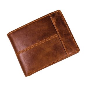
Leather Wallet
 NewOut of stock
Jackets
Rain Jacket
Quick add: the button rises at the foot of the photo on hover
 -25%
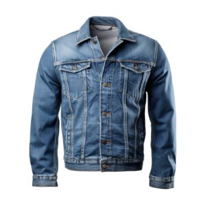
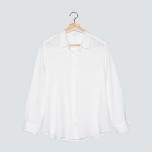
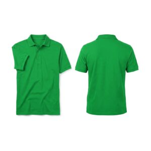
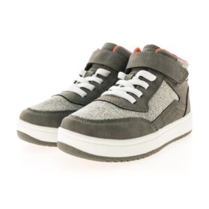
Slide up: on hover the photo and the text rise and the button comes up from below
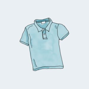
Shirts and polos
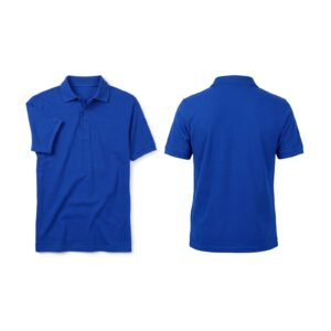
Pocket Piqué Polo
Eyewear
Sport Sunglasses
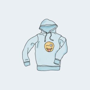 Out of stock
Pullovers
Weekend Pullover
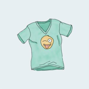
Graphic tees
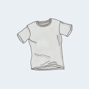
Logo Graphic Tee
Editorial: plain, tall photo, large title, sale price in the brand color, no button

Accessories
Summer Essentials
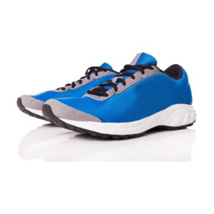 Out of stock
Running shoes
Trail Running Shoe
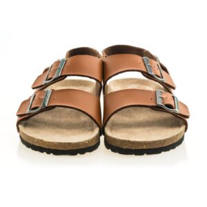 -20%
Sandals and espadrilles
Leather Sandal
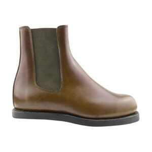
Boots
Leather Ankle Boot
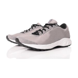
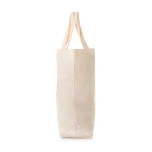
Compact grid: six per row for wide shops and related products
 -25%
 -19%
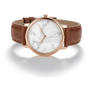

Horizontal: lists and wide columns, with quantity
 -20%
Singles
Golden Hour Single
 Out of stock
Caps
Dad Cap
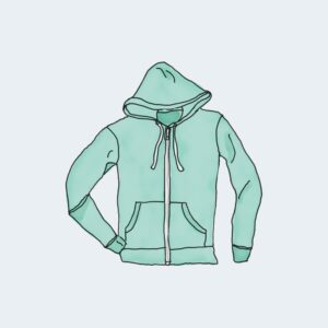
Zip hoodies
Fleece Zip Hoodie
Singles
Rain Single
Compact horizontal: sidebars, heroes and search results
- -21%
- -21%
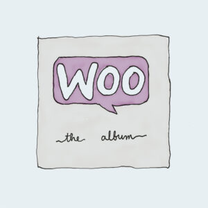 -19%
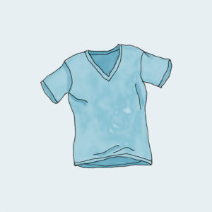
On a soft background
The cards, badges and buttons work the same on a soft section.
Soft: the shop card
- Out of stock
Soft: compact horizontal with an icon button
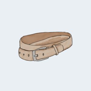 -16%
- -16%